Delightful
Too much delight ruins the fun.
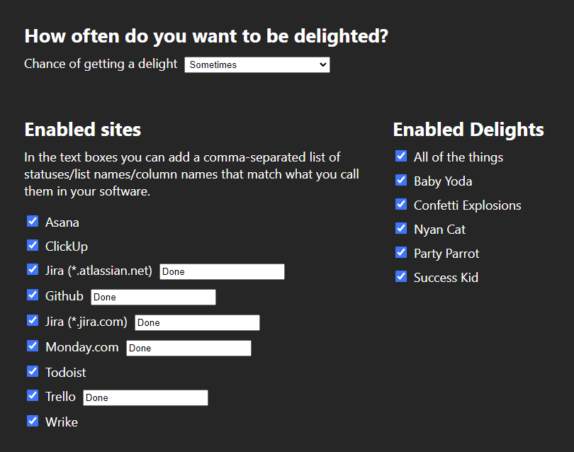
An open source Google Chrome extension. Originally inspired by Asana delights (Asana celebration creatures) not working for a while.
I've made a few browser extensions in the past, but they were boring automations for work... whereas Delightful provides its users profound bouts of joy to break the increasing tension of their work day.
Wanna see an example?
Made for the most popular project management software

Some of the delights were developed and/or animated by other people. The original concepts are all well-known memes so far. All attributions are given with links where possible on the Delightful Github repo.
Granular settings
You have granular control over how the extension works. With experience, you'll find the specific way that works for you.
What's next for Delightful?
I'll continue adding new delights now and then when I get time. Apart from that it is open source, so hopefully I'll pick up a contributor or two.
Flippy tiles
I wrote this code, and then completely rewrote it two more times, and all with different features, in different environments.
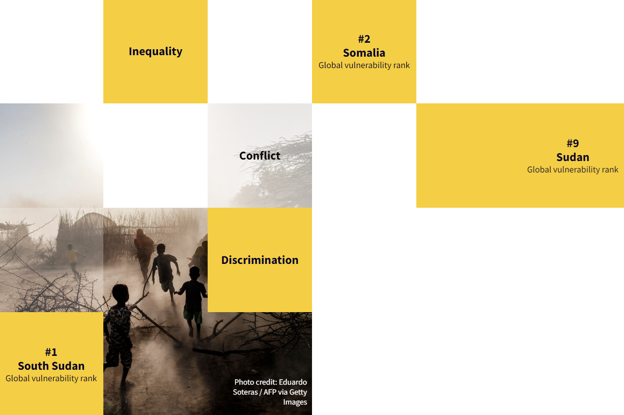
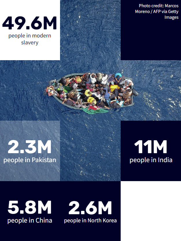
- First time was for the Global Slavery Index. There it's a highly customisable Gutenberg block for Wordpress. In the editor you can choose number of columns and rows, specify a subsection of tiles where an image will display, add inner blocks into each tile to show text or even a different image, add background colors and opacities to the whole thing and each separate tile, etc.
- Then I rewrote it as React components, because at the time I was developing this site in React.
- Finally I rewrote the whole thing again in vanilla javascript for this site (as shown on the home page). Since I'm using vanilla Javascript and currently don't have a wysiwyg editor, it doesn't have editor features. But I change how it works with some new features:
- The image mimics the behaviour of CSS background-size: cover, but calculated in Javascript.
- It will calculate and redraw the tiles to be as close as possible to square in a predefined tile size range, per breakpoint, given any viewport size or aspect ratio. Wow, that was a mouthful... and the maths was a mind-bender.
- You might also notice that the darkened tiles are randomised... the closer to the outside of the viewport, the more likely it will show darkened tiles, and the darker they may appear.
- I added a multi-tile content layer. The randomised darkened tiles are made to not overlap with multi-tile content. Multi-tile content can be set to n-tiles from the left or right, and n-tiles from the top or bottom, and n-tiles width/n-tiles height. Obviously you have to be careful to consider many device sizes and orientations, although I did build in some smarts to cover such scenarios.
Here are some examples from the Global Slavery Index on walkfree.org.

Okta integration with Wordpress
I'm aware the white line in the image does not correctly represent the PKCE flow... it's just for show.
Before Okta provided a PHP SDK, they had a simple example script for PHP that only got you through to a working state. It was not well planned, and sort of half did a thing with the Wordpress nonce to prevent a replay attack, until they would have worked out that you don't have access to the nonce or even a custom nonce in the REST API. I used a few of the critical parts of that script, and wrote a new thorough class which uses PKCE flow, and integrated it into Wordpress.
To improve on that even more, I added another three layers of security that run at different points of the process. After that you can set up MFA in Okta.
With all that setup, if you've already authenticated with SSO and MFA, you can simply go to the admin section and be automatically logged in with no fuss.
If you don't have permissions, you're definitely not getting through. It's been relentlessly tested internally, and third party penetration tested multiple times.
Recursive menu walker
The Wordpress menu walker is the PHP code that traverses through the menu items that you create in the backend, and converts them to html output for the frontend. The menu walker recursively walks through every menu item, which can have unlimited depth of child menu items (until you reach server or browser limits).
To make a fully custom menu structure, you can copy and override the menu walker. When you have different things happening at different levels, the recursive flow can get quite mind-boggling.
The site has been completely redesigned since this work so there's no live version to see, however I was able to get a screencast video of desktop and mobile versions before it was changed.
On both the backend and frontend I had to recognise if the menu was being used as the primary or secondary nav. The primary nav has a separate fancy layout for the initiatives, and another horizontal layout with black background for the top-level of the secondary nav.
The mobile versions have modified layouts of their desktop equivalents, and it was made to maintain the current state even while changing the width of the browser between desktop and mobile views. Nothing is duplicated to make the design work well from desktop to mobile, it's all meticulously made to transform from one view to the next in any case.
Just outside of the menu, you'll see the logo in the middle. There are a few different animations for this, depending on if you're inside/outside an initiative. It auto-shrinks the header on scroll-down, and animates the logo changes and current initiative name (if you're currently in an initiative).
Plastic Waste Makers Index - Scorecards
There was a fairly simple custom API I made for these cards, but the project (for me) was mostly about the frontend mechanics of the cards.
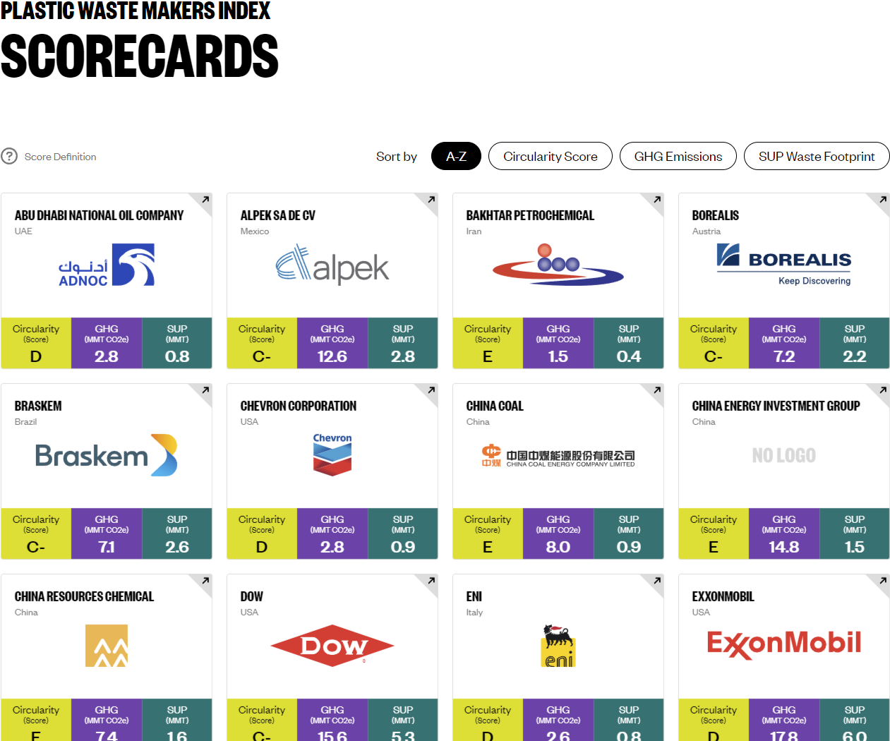
Like anything made for web, if I could make the experience have little or no friction, then the mechanics and functionality should fade into the background so the user can concentrate on why they ended up there - which is to bring attention to the companies with the highest contributions of plastic waste.
There were a few well-timed visual-trickery parts to this, which was the polish to make them transition smoothly. There's no 3D library/framework on this site, it's all plain CSS styling with transforms, transitions, and core javascript animate.
Interact with the scorecards at Plastic Waste Makers Index - Scorecards.
APIs - Global Fishing Index, Global Slavery Index
Fairly complex SQL queries, some spanning over 30 lines of code. Rather than looping and building a response in PHP, it was mostly done in SQL for better performance.
Performance is a big factor when scaling this much. The popularity of these APIs worldwide can be very taxing on the servers. So extra measures were taken, for example the query results are cached, and some are served from a separate CDN.
Making use of the latest JSON functions in MySQL made it possible for most of the queries to go directly from the SQL to response output with very minimal need for post-processing in PHP, with some endpoints having no PHP processing.
This reduced the load on the server instances, meaning we could have fewer instances set in the auto-scaling settings, ultimately saving costs while maintaining a smooth user experience.
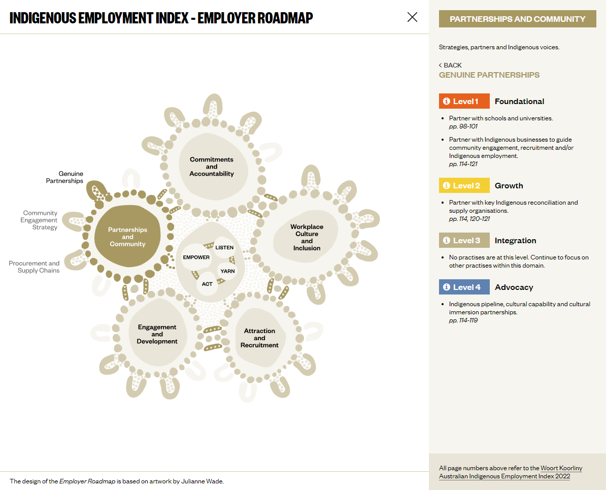
SVGs and the Employer Roadmap
SVGs? they've been around for years... so what's the big deal about them now? Well it's more about me I guess, the fact that I've done quite a lot of work recently with writing SVG code manually - creating and/or modifying them in code rather than simply exporting them from an app like Adobe Illustrator.
Of course it helps to use Illustrator together with the code, but I'm still fascinated to see what visual drawings can be made from code without the help of a visual editor. For example, although very simple, the highlights of this section of my website - specifically the detail view you're reading right now, were made only with code.
If you're on a screen that's wide enough you'll see some unusual rounded corners on the top left and right of this white panel. They're just SVGs that I created purely from code. It's a bit nostalgic actually since it takes me back to somewhere around 1998 when I was creating rounded corner GIFs for elements like this, and it seems we've come full circle on that, lol.
Then there's the button to expand/close this detail view. I made that from code. In fact both of those examples are technically maybe not SVGs, but they do use the same syntax. They are clip-path pseudo elements done in pure CSS.
See the Indigenous Employment Index - Employer Roadmap near the bottom of this page, which is an SVG that started out as a simple vector image when I received it. I cleaned it up the little and strategically grouped and named every layer using a naming convention that could be automatically picked up and structured for animations based on the layer names, in the Javascript code.
It was a fun time animating the SVG, which included elements external to the image itself, making the surrounding elements all part of the overall interactive experience.
3D Showcase
Behind this detail view is the 3D showcase. The showcase and detail view work together to create the full experience. The 3D part behind the detail view is made with Three.js. It's a fairly simple 3D scene.
Almost all of the 3D part could be done in CSS and Javascript, but we get some hardware acceleration with WebGL and a simplified code layer with Three.js.
The main thing that you can't do in CSS (without a huge amount of faffing around) is the curved surface of the slides, which I think is the coolest part.
Secure file uploads with antivirus
Multi-file uploads built into Wordpress custom-made forms. The files are sent to a secure storage location that's not accessible by anyone until the files have been scanned and sent to an accessible location.
A Node.js function which runs in Lambda, scans the uploaded files, determines if they're a threat or not, and distributes them accordingly.
The system was made with multiple Lambda functions, and this one was a team effort to get it across the line. Apart from the function that scans and distributes the files, another function regularly updates itself with the latest version of the core virus scanning script, and another function keeps the latest virus definitions updated.
The functions also use AWS SNS and SQS to keep track of scans between systems, plus reporting in other systems.
Deployment of all functions is automated with Docker and Git.
Annual Report for Minderoo Foundation
This was a huge team effort. Particularly notable in this annual report was the best framework we found to use at the time was none at all, just like I found with this site.
A quick run-through of the features
- Overall structure is one main element, and one side-journey element. There are a lot of sections and subsections within each.
- Nav. Quite fancy if I do say so myself, especially with the content transitions - which only happen when you navigate more than 3 subsections away from your current location, otherwise it smoothly scrolls.
- Titles of the main sections have a scroll effect. It's hard to describe, so just check it out for yourself. There's a screenshot below showing mid-way through a title scroll.
- Loading assets. There are a LOT of assets to load, and you could land at any stage of the site. Therefore, an asset loading algorithm was made to load assets by expanding the radius from your current position on the site. And if you change your position, it will recalculate and load from where it was last up to. Always keeping track of which assets have already been loaded, and predicting where you're likely to go next... to give the smoothest possible experience.
Visit the site at Minderoo Report.
The nav

Visually changing title (mid-way through)

Publications and publication nav
Publications, a custom-made standalone system written in PHP. We needed to convert it to be fully embedded into Wordpress. The tool has a lot of functionality suitable to research and academic output. It's like a whole CMS... in Wordpress... which is also a CMS, so yep, we put a CMS in the CMS. It was necessary, and worth the effort though.
This is the main system we used to show the Global Fishing Index on minderoo.org (no longer in use), and Global Slavery Index on walkfree.org.
I won't get into detail with this, it's just too big and complex to describe it here.
The main features you can see on the front end are the floating nav, and the end-note functionality.
Check it out at Global Slavery Index > Regional Findings > Africa.
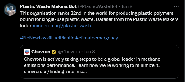
Twitter Bot
Yes, I made a bot, but it's for a good cause.
It searches for the latest tweets from the top 100 plastic waste makers, and quote tweets them using a selection of random of tweets. Within those random tweets there are data points that are replaced with data about that specific company.
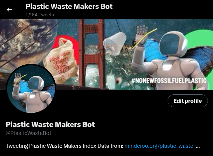
The bot was part of the plastic waste makers index campaign for 2022. It was used to help call out companies who are greenwashing on their social media.
The bot was developed in Node.js and deployed to Lambda. It ran for a few months, and then Elon made that level of API access $100/month, which wasn't accounted for in the budget.
Home care calculator
A custom interactive calculator made to be used by home care specialists in collaboration with elderly people in need of care in their home.
The calculator shows the available services, and how they can spend their home care subsidy to enable them to stay at home longer. This project was quite a challenge, because it had to meet strict standards internally, at the same time as a WCAG AAA rating, because of the target audience having a high rate of visual and other impairments.
The app was made with a Laravel backend, React frontend, and integrated with ADFS/Active Directory to enable easy access for staff. It was also integrated with Procura (now Alayacare) home care system using a program I wrote in GO (GoLang) to automate the process. The app outputs a custom PDF document for the client, and previous to the Procura integration, it emailed a spreadsheet for staff to manually enter the details into Procura.
Here's a little screencast video from initial testing.